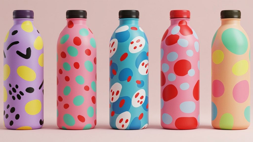
The Importance of Brand Consistency in Packaging Design
In the competitive world of consumer goods, packaging design plays a crucial role in attracting customers and conveying brand messages. Whether it’s glass bottles or plastic containers, packaging design serves as a visual representation of a brand’s identity and values. One key aspect of packaging design that emerging brands should prioritize is brand consistency. In this article, we will explore what brand consistency means, why it is important for emerging brands, potential pitfalls to avoid, and showcase examples of successful brands that have excelled in brand consistency within their packaging design.

What is Brand Consistency?
Brand consistency refers to the practice of maintaining a unified and cohesive brand image across all platforms and touchpoints. It encompasses every aspect of a brand’s identity, from its logo and color palette to its tone of voice and packaging design. Consistency in packaging design ensures that consumers can easily recognize and associate a product with a particular brand. It builds trust, loyalty, and brand recognition in the minds of consumers.

Why is Brand Consistency Important for an Emerging Brand?
For emerging brands, establishing a strong and recognizable brand identity is essential for standing out in a crowded marketplace. Here’s why brand consistency in packaging design is particularly crucial for emerging brands:
1. Building Brand Recognition: Consistent packaging design helps create a strong visual identity that consumers can easily associate with a brand. When consumers consistently encounter packaging that reflects the brand’s unique style, they are more likely to remember and recognize it among competitors.
2. Establishing Trust: Consistency in packaging design instills a sense of trust and reliability in consumers. When packaging design is consistent, it conveys that a brand is committed to quality and professionalism.
3. Differentiation: In a saturated market, consistent packaging design can set an emerging brand apart from the competition. It allows the brand to communicate its unique selling points effectively and make a memorable impression on consumers.

Potential Pitfalls in Brand Consistency and Packaging Design
While brand consistency in packaging design is essential, there are some potential pitfalls that emerging brands should be aware of and avoid:
1. Inconsistency Across Platforms: It’s crucial for emerging brands to ensure that their packaging design aligns with their overall brand identity across all platforms, including their website, social media, and physical stores. Inconsistencies can confuse customers and dilute the brand message.
2. Lack of Clear Guidelines: Without clear brand guidelines, inconsistencies can easily creep into packaging design. It’s essential for emerging brands to establish detailed guidelines that define the brand’s visual elements, such as colors, fonts, and logo usage, to maintain consistency.
3. Neglecting Packaging Hierarchy: Packaging design should effectively convey the brand message and product information. Neglecting proper hierarchy in design can result in cluttered and confusing packaging that fails to communicate the brand’s value proposition.

Examples of Brands with Consistent Packaging Design
1. Apple: Apple is renowned for its consistent and minimalist packaging design across its range of products. The clean lines, minimal use of text, and focus on product visuals create a distinct and recognizable look, reinforcing the brand’s commitment to simplicity and elegance.
2. Coca-Cola: Coca-Cola has maintained a consistent packaging design for decades, featuring its iconic red color, distinctive logo, and classic contour bottle shape. This consistency has allowed Coca-Cola to establish itself as a global beverage brand that consumers can easily identify.
3. Tiffany & Co.: Known for its luxury jewelry, Tiffany & Co. has a consistent packaging design that reflects its brand identity. The iconic Tiffany Blue box with a white satin ribbon instantly evokes a sense of elegance, exclusivity, and luxury.
4. Nike: Nike’s packaging design consistently reflects its energetic and dynamic brand image. The use of bold typography, vibrant colors, and the iconic Swoosh logo on every package creates a sense of unity and brand recognition. Whether it’s a pair of sneakers or sports apparel, Nike’s packaging design maintains brand consistency and reinforces its commitment to athletic excellence.
5. Chanel: Chanel, a renowned luxury fashion brand, exemplifies brand consistency in its packaging design. The elegant black and white color scheme, the interlocking CC logo, and the use of high-quality materials create a sense of sophistication and timeless beauty that is consistent across all Chanel products.

Final Thoughts
Brand consistency in packaging design is of utmost importance for emerging brands. It helps build brand recognition, establish trust, and differentiate brands in a competitive market. However, emerging brands must be mindful of potential pitfalls such as inconsistencies across platforms, lack of clear guidelines, and neglecting packaging hierarchy. By studying successful brands like Apple, Coca-Cola, Tiffany & Co., Nike, and Chanel, emerging brands can gain valuable insights into how to achieve and maintain brand consistency in their own packaging design. By creating a cohesive and recognizable visual identity, emerging brands can make a lasting impression on consumers and pave the way for long-term success in the marketplace.
