How to Choose the Right Colors for Your Product Packages
There are many different elements of product packaging that businesses need to consider. You need to choose what type of packaging material to buy for each of your products, make important decisions about the shape and size of the package, design the label and logo, and more. One important step that some people underestimate is of choosing colors for your product packaging design.
Many design professionals acknowledge that color is a crucial element for packaging, but we think people still underestimate its importance. A whopping 85% of consumers say that they make purchasing decisions based on color. Therefore, choosing the right colors for your custom product packaging can make or break the popularity of that product. Let’s discuss the psychology of color usage in product packaging design and how to package your product for maximum visibility.
The Psychology of Color Usage in Packaging Design
When we see different colors, those colors generate an emotional response. They influence the way we behave, and they trigger psychological connections in our minds. Each common color elicits a specific psychological reaction, so let’s determine what emotions these colors typically evoke.
Before we start, it’s important to point out that brightness and shading also play a part, so take these descriptions with a small grain of salt. Still, brands need to be concerned with how the color of their packaging supports the brand’s personality in a way that encourages potential consumers to buy the product.
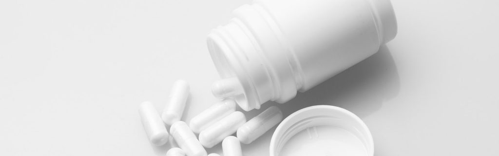
White
White product packaging design indicates simplicity, and our minds view these products as safe or traditional. For instance, many Apple products are manufactured in white color schemes, and the advertising for these items is also simple and elegant. Apple wants consumers to feel like their products are a routine part of their everyday lives, and white colors are used to reflect this notion.

Black
On the other side of the color spectrum is black packaging, often used to evoke feelings of class or sophistication. That’s why it’s a popular option for luxury brands like Coach and Jaguar, just to name a couple. However, black coloring in your product packaging design can also make consumers feel that your products are strong and durable. This is why you’ll often see athletic brands like Adidas frequently using black when designing custom product packaging.
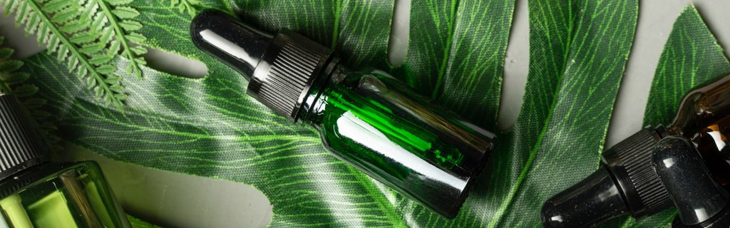
Green
When determining how to package your product, green colors are a great way to indicate natural or organic brands. The fact that “going green” is a synonym for being environmentally friendly certainly doesn’t hurt — this color makes consumers think of nature or earthiness. The next time you’re at the grocery store, look at the organic foods aisle and try to find a package that doesn’t have any green in it. Good luck because you’re going to need it!

Yellow
The brightness of yellow packaging typically makes people think of fun, carefree experiences, which is why this color is so frequently used to create custom product packaging aimed at young people. For example, consider the bright yellow coloring typically used in Lego branding. It can also be used for products that aim to make older people feel youthful, such as energy supplements.
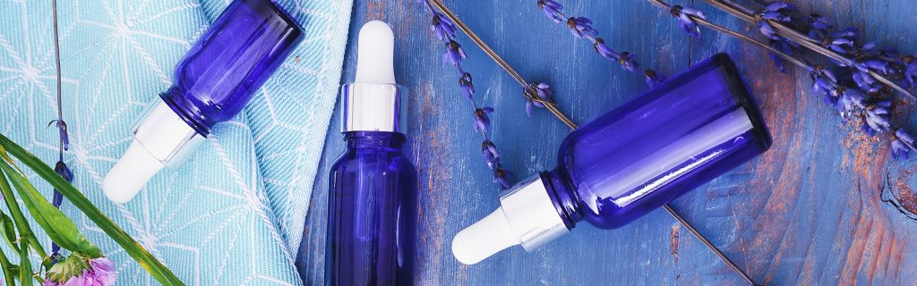
Blue
Blue colors in product packaging design are often seen as being safe or even boring. Blue is a very common color in custom product packaging, and it can be used to evoke impressions of dependability and honesty. It might be boring, but blue packages are often effective as well. Food and beverage brands love blue packaging — for example, take a look at a Pepsi can or a package of Gerber baby food.
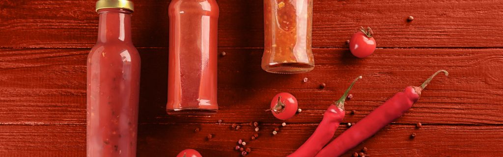
Red
In contrast to the ho-hum reliability of blue packaging, red product packaging design conveys a sense of excitement and energy. This is the color you want if you’re trying to market a product that evokes passion in your customers. In this regard, it’s fascinating to compare the marketing decisions made by Pepsi — with its “safe” blue package — and Coke, which has a famously bright red can. Like blue hues, the exact shade of red you use in your product packaging design matters: dark reds indicate a more professional, buttoned-up product, while light reds are a bit more youthful and exciting.
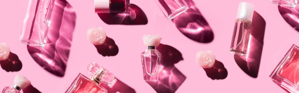
Pink
A favorite of the beauty industry, pink is a color often associated with romance and beauty. Historically, Pink has been attributed to different genders at different times, but today it’s a color for any gender. A particular range of pink shades became a macro-trend when “Millennial Pink” took the world by storm and solidified itself as a staple in the design world alongside rose gold-colored metals.
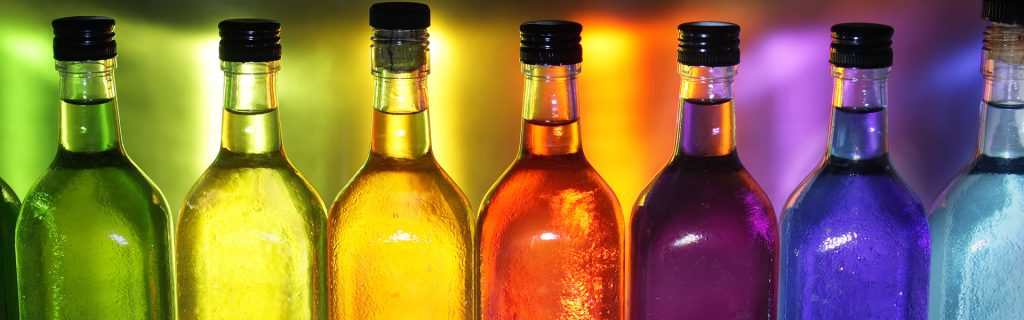
Combining Colors for Maximum Effect
You can say a lot about your brand by using a specific color in your custom product packaging. In addition, combining multiple colors can create a complex message. Using complementary colors can produce a harmonious appearance while using contrasting colors can be exhilarating — or confusing if done incorrectly. When using multiple colors, make sure you understand how your chosen colors will work together (or against each other, as the case may be).
Conclusion
Choosing the right colors for your product isn’t always easy. Thankfully, BottleStore.com is here to help. Feel free to reach out to our representatives, and we’ll be happy to discuss the many different colors of custom product packaging we have in our inventory.
2 thoughts on “How to Choose the Right Colors for Your Product Packages”