The Benefits Of Minimalism In Packaging Design
When it comes to packaging design, the design mantra “less is more” is as ubiquitous as it gets. Minimalist design has gained popularity in the past decade largely due to its simplicity, elegance, and effectiveness in conveying a brand’s message. Minimalism in packaging design means using simple shapes, clean lines, and a limited color palette to communicate a brand’s identity and values. In this article, we will explore the benefits of minimalism in packaging design and showcase some examples of brands that have effectively used minimalism to set themselves apart from their competition.
Enhancing Brand Identity
Minimalist design is all about stripping away the excess to focus on the essential. When applied to packaging design, this means that only the most important elements are included on the label or packaging. This allows a brand’s identity to shine through, as there are no distractions from extraneous design elements. A minimalist design can help a brand appear sophisticated, refined, and confident.
Prolific Example: Apple
The minimalist design of Apple’s product packaging has become an iconic representation of the brand’s identity. The clean lines and simple shapes communicate the brand’s commitment to simplicity, elegance, and innovation. You would be hard pressed to find a computer hardware manufacturer that presents itself in a more compelling, intellectual, and sophisticated manner.

Increasing Shelf Appeal
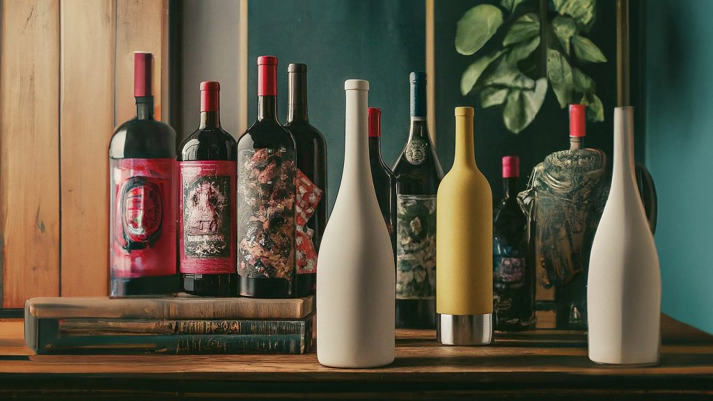
Minimalist packaging stands out on shelves because it is distinctive and eye-catching. Just as loud colors, frantic artwork, and dazzlingly complex color palettes can help product packaging stand out – a minimalist design can achieve the same goal by enabling a product stand out in a sea of busy, cluttered designs, making it more likely to be noticed by consumers. Additionally, minimalist packaging can convey a sense of affluence or luxury, which can increase the perceived value of a product.
Prolific Example: Glossier
The minimalist packaging for Glossier’s beauty products has helped to make the brand stand out in a crowded market. The simple, pastel-colored labels are distinctive and recognizable, and convey a sense of sophistication and refinement.

Reducing Environmental Impact
Minimalist packaging can help to reduce the environmental impact of a product by using fewer materials. By reducing the amount of packaging material used, a brand can decrease its carbon footprint and reduce waste. Minimalist packaging can also be easier to recycle, as it is often made of a single material.
Prolific Example: Lush
The minimalist design of Lush’s cosmetics packaging is not only eye-catching, but also eco-friendly. The brand’s commitment to sustainability is reflected in its packaging, which is made from recycled materials.

Improving User Experience
Minimalist packaging can improve the user experience of a product by making it easier to access, store, or transport. When leveraging a clean, simple design, a brand can make it easier for consumers to understand how to use the product or what its benefits are. Minimalist packaging can also be more functional, as it eliminates distractions and focuses on the key information that consumers need to know.
Prolific Example: Method
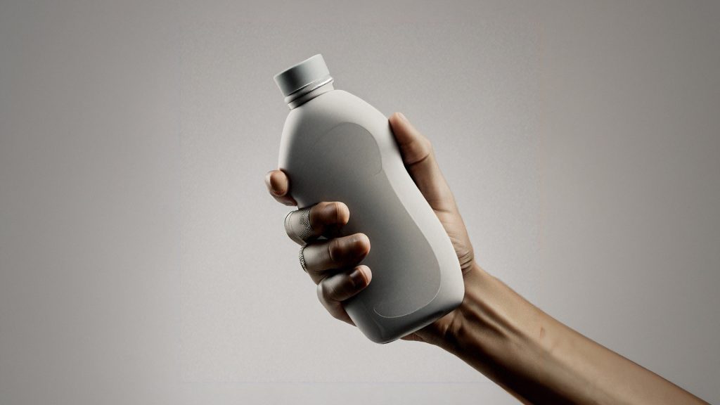
The minimalist design of Method’s household cleaning product packaging is not only visually appealing, but also functional. The simple labels communicate the product’s intended use and make it easy for consumers to select the right product for their needs.

Cost-Effective
Minimalist packaging can be cost-effective for brands. By using fewer design elements and materials, a brand can reduce the cost of packaging production. Minimalist packaging can also be easier and cheaper to ship, as it is often lighter and takes up less space than more elaborate designs.
Prolific Example: Trader Joe’s
The minimalist design of Trader Joe’s private label products has helped the brand to keep prices low while still maintaining a high level of quality. The simple, bold labels are cost-effective to produce and allow the brand to focus on what matters most: the quality of its products.
Closing Thoughts on Minimalist Packaging Design
Minimalist packaging design can provide many benefits to brands, including enhancing brand identity, increasing shelf appeal, reducing environmental impact, improving user experience, and being cost-effective. By using clean, simple design elements, brands can communicate their values and make their products stand out in a crowded marketplace. Many well-known brands have utilized minimalist packaging design to set themselves apart from their competition and create a distinctive visual identity.
As a manufacturer of bulk and wholesale glass and plastic bottles, jars and jugs, BottleStore.com recognizes the importance of packaging design in creating a strong brand image. We offer a wide range of packaging options to suit any brand’s needs, from simple, minimalist designs to more elaborate, eye-catching labels. Our goal is to help our clients create packaging that not only looks great but also functions effectively and reduces environmental impact.
Minimalism in packaging design is a trend that is here to stay. By focusing on the essential and eliminating the unnecessary, brands can create packaging that is not only visually appealing but also functional and cost-effective.
As a manufacturer of packaging solutions, BottleStore.com is committed to helping our clients create packaging that effectively communicates their brand’s identity and values, while also meeting their practical needs.
