Use Colorful Packages To Tell Your Brand’s Story
When you’re out shopping, chances are you notice an item’s packaging right away. After all, it’s the first chance a brand has to make an impression on you. While some businesses take this opportunity and run with it, others struggle to leverage packaging in a meaningful way.
In addition, brands also need to take the time to establish effective brand colors to create uniformity throughout their packaging efforts. When different product lines don’t look like they belong to the same brand family, or they don’t have a consistent brand color palette, it can confuse buyers and cost you sales.
When you’re learning how to choose brand colors, here’s some information to help you get started.
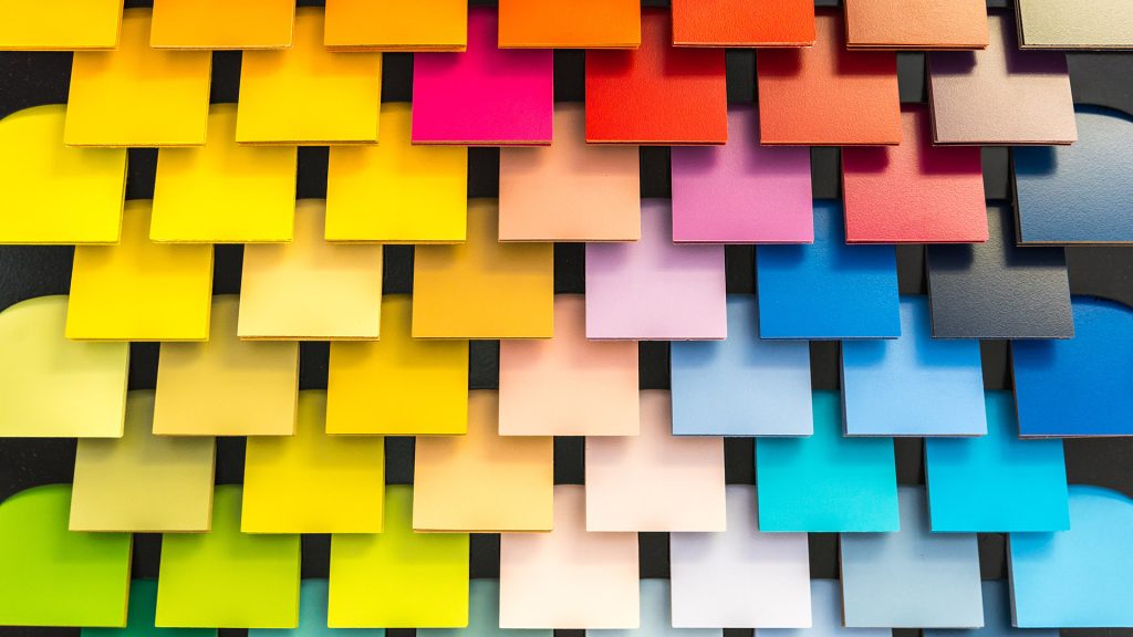
Pantone Color System
The Pantone Color System, also known as the Pantone Matching System, is a general standardization system that assists with color selection and color matching. Using this intuitive numbering system to identify different colors makes it easier to get exact shade matches and find complementary brand colors for designs.
Within the Pantone Color System, there are 1,114 different colors, each with its unique color name and identifying number. Using this standardized system, when you’re coordinating packaging or sending label requests to regional manufacturers, it’s a snap to refer to a Pantone chart to standardize color usage across all markets and locations.
Using the Pantone Color System helps ensure a consistent brand color palette, which can greatly influence a customer’s opinion of your business. With a standardized color chart, you have more peace of mind regarding color compatibility and uniformity.
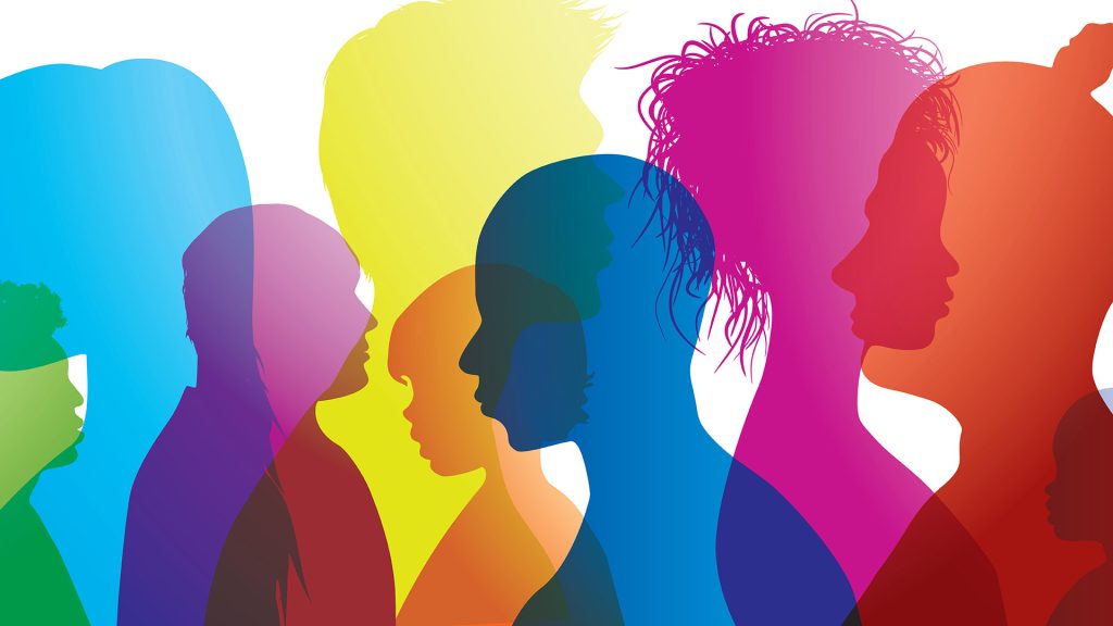
The Psychology Of Color Types
Different colors impact people in wildly different ways. Reds attract the most attention, raise our blood pressure, and can signify anything from strength to danger.
Green shades emulate natural colors and symbolize growth and harmony. Many individuals consider green to be a beneficial color for the body and mind since it induces a calming effect that can help slow the human metabolism.
Blues are unique and authentic colors that look calming and refreshing. As opposed to red’s intensity and passionate feeling, blue is more relaxed and serene. If we asked you to picture something calming, chances are you might think of something blue, like a peaceful body of water.
Browns are dependable and sturdy, oranges are energetic and happy, yellow promises joy and intellect, and pink is tender, loving, and caring. With so many different color and emotion combinations, it’s critical to strike the right balance with your brand color psychology.
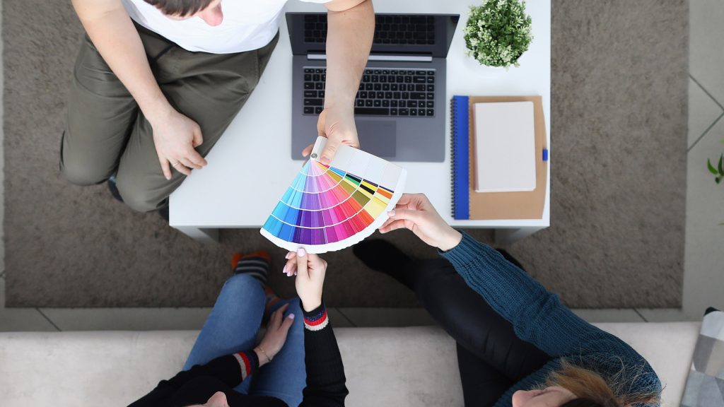
How To Pick The Best Colors For Your Brand Packages
By following a few simple steps, it becomes easier to tap into brand color psychology and choose the perfect brand colors for your packaging needs.
For starters, define your target demographics. Too many businesses say they sell to “everyone,” even if they don’t necessarily sell products with universal appeal. Find what differentiates your brand and who that speaks to. Then, you can tailor your brand colors to fit that vision.
It’s also incredibly helpful if you look for inspiration. For instance, take a look at what your competitors are promoting with their packaging. Do you see similar color stories or themes? You can always take inspiration from a successful design or use this time to spot trends and find colors that help your brand stand out.
The Secrets To Developing Perfect Colorful Product Packages
Once you’ve outlined your packaging process, you’re ready to unlock a few of the hidden secrets behind packaging color selection.
This step is significant since the packaging is your first chance to wow your customers. A high-quality package should reflect your brand, clearly and concisely. The wrong branding color schemes can send a message you aren’t trying to convey.
To choose the perfect brand colors for your packaging, determine whether or not your packaging emulates your competitors or stands out from them. If you have a hard time quickly spotting your product in a lineup, the colors and branding might be off.
Also, determine that your product package is appropriate for your target demographic. Use colors that complement the core emotions you want your products to evoke. Leverage colors in ways that make sense to the eye and the brain.
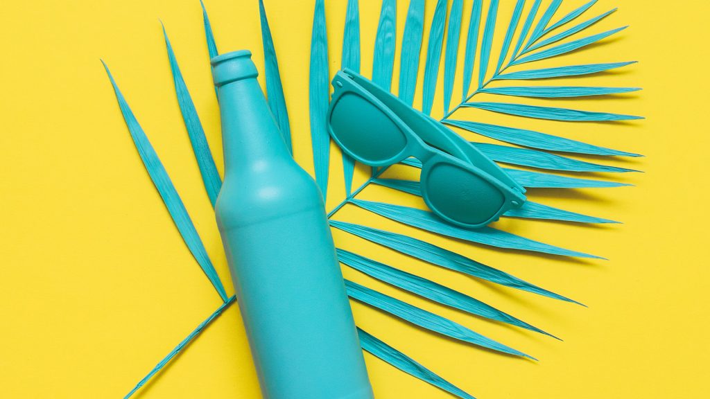
Colorful Favorites From BottleStore.com
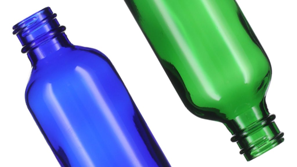
Colorful cans and glass jars serve both practical and aesthetic purposes to highlight your branding color schemes. For instance, take BottleStore.com’s one-ounce cobalt blue big bead Boston round glass bottles. With a straight body panel design that’s ideal for silk screen decorating and picture-perfect label application, the cobalt blue color also pops on shelves and attracts the customer’s eye.
We also offer the same big bead Boston round glass bottles in green, with bottle sizes perfect for spreads, creams, gels, and more. In addition, you can choose between closures, such as the flat cap option or the dropper top, which is the ideal fit for tinctures or bottled liquids.
Then, there are BottleStore.com’s rich amber bottles. From glass dropper bottles to straight-sided flush-fit jars, the amber glass collection is perfect for filtering light and boosting the shelf life of your contents.
Contact us today to learn more about BottleStore.com and our colorful assortment of jars, bottles, and closures. We’re here to help you with all your container and closure needs!
It doesn’t matter what industry you’re in, or what kind of products you sell. If you’re wondering how to choose brand colors, BottleStore.com has the colorful containers you need to package your products and deliver your brand’s message.
I agree. We have been selling glass containers for many years and have already proven the effectiveness of different glass colors on the level of sales. Olive oil definitely sells better in green bottles!